Branding
What is an Arabic-first brand identity, and why does it matter?
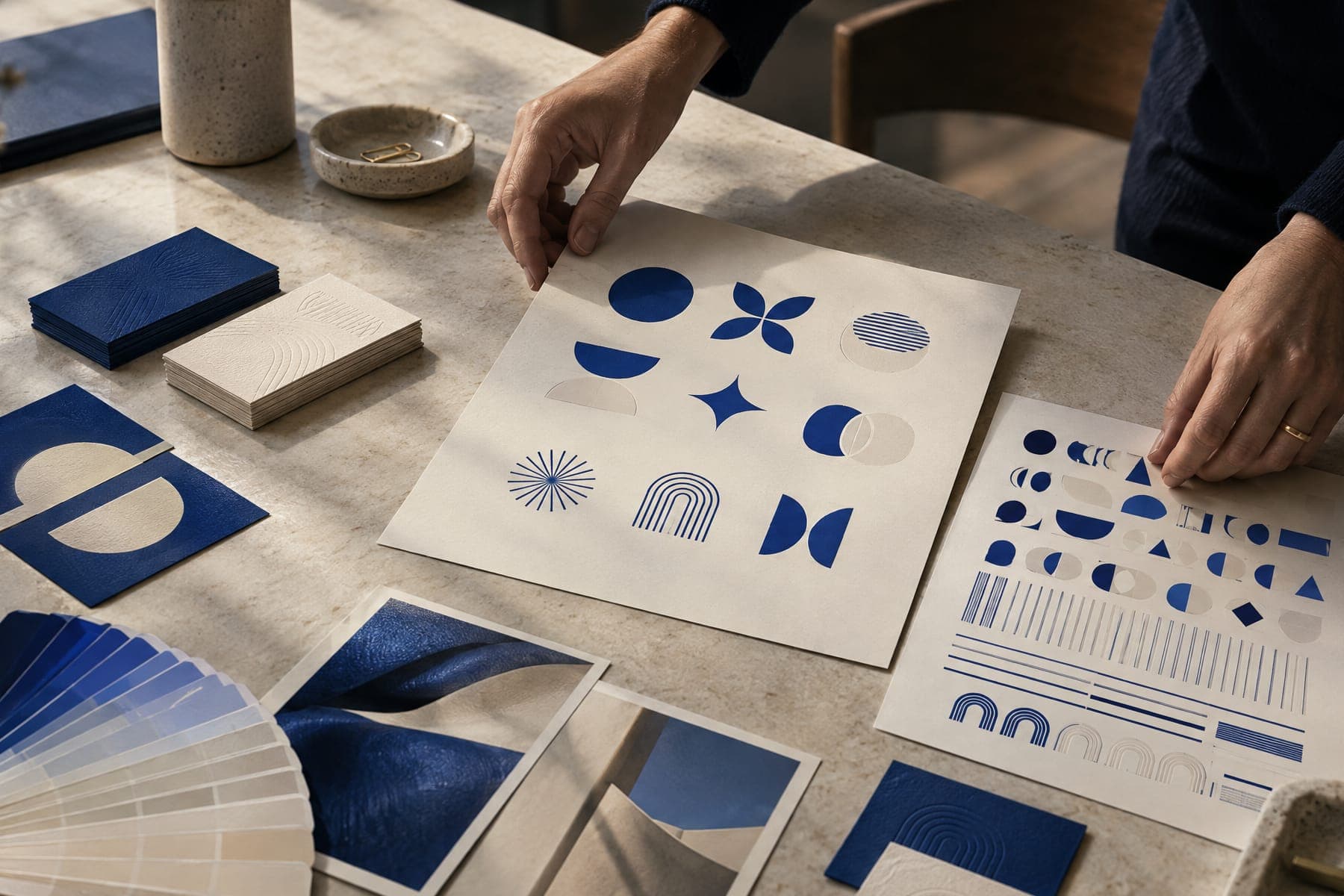
An Arabic-first brand identity treats Arabic as a primary voice, not a subtitle. The Arabic name, wordmark, tone and layout are designed alongside the Latin versions from the first day and written as original copy, not translated. It matters in Qatar and the GCC because many audiences read the Arabic first, judge its quality instantly and notice when their language is an afterthought.
What does Arabic-first actually mean?
An Arabic-first identity is a brand system where Arabic is designed and written as a core language from the start. It is not Arabic-only, and it does not mean English is weaker. It means the Arabic name, wordmark, typography, tone of voice and layouts are created in the same room, at the same time and with the same care as their Latin counterparts.
Most bilingual brands in the region are built the other way round. The English identity is finished, approved and launched, and Arabic is added later by whoever is available. The result is familiar: a Latin logo with Arabic text typed underneath in a default font, a slogan translated word for word, and a website where the Arabic version breaks on every second page.
Arabic-first also means deciding which language leads in each context. For regional campaigns, government work, cultural moments and Qatari audiences, Arabic usually leads. For international and portfolio contexts, English often leads. Both lead equally only when a piece is genuinely written for both audiences. The identity has to support all three situations without looking like two separate brands.
Why should Arabic be written, not translated?
Translation moves words from one language to another. Brand writing moves an idea. A short English line often works because of rhythm, a double meaning or a cultural reference that does not exist in Arabic. Translate it literally and you keep the words but lose the reason the line worked. Gulf readers notice this immediately, and it tells them the brand was not made for them.
Written Arabic starts from the same strategy and the same intent, then finds its own idea. Sometimes the Arabic line ends up close to the English. Sometimes it needs a completely different image or structure to land with the same force. That is expected, and a good bilingual brief says so in writing, so nobody judges the Arabic by how closely it mirrors the English.
Register matters too. Brand Arabic for business and institutional audiences is usually written in Modern Standard Arabic, because it reads with authority across the whole region. Gulf dialect can work for social content, film dialogue or a deliberately local campaign, but it is a creative choice with a reason behind it, not a default. Mixing the two carelessly in one piece weakens both.
- Brief Arabic and English writers on the same strategy at the same time.
- Judge the Arabic by intent and impact, not by closeness to the English.
- Use back-translation only to check that the meaning still matches the strategy.
- Decide the register (MSA or dialect) per channel, and write it down in the tone of voice guide.
How do you design a bilingual wordmark and type system?
Design the Arabic and Latin wordmarks as a pair. Arabic letters connect, sit on a different baseline logic and have proportions that do not map onto Latin capitals or lowercase. Typing the brand name in an Arabic font under a custom Latin logo almost never works. The Arabic wordmark should be drawn with the same idea, stroke logic and attitude as the Latin one, so each could stand alone and both clearly belong together.
Match the two scripts optically, not mathematically. At the same point size, Arabic often looks smaller than Latin. In our own system, Arabic display text starts at roughly 1.15 times the Latin size and is then adjusted by eye until both carry the same visual weight. The same applies to stroke weight: a bold Latin cut and a bold Arabic cut from different families can feel very different on the page.
Choose typefaces as a pair with shared logic. A geometric sans works best with an Arabic face built on similar construction, not with an ornate calligraphic style that comes from another tradition. Type families that cover both scripts help consistency, but still test each script on its own merits. Check the wordmark at small sizes, in app icons, on a phone screen and on a building, because Arabic detail closes up faster than Latin at small sizes.
What typographic rules does Arabic need?
Arabic needs more vertical space than Latin. Letters rise and fall further, and dots and diacritics need room. Forcing Arabic into the line height set for English makes it look cramped and harder to read. As a working range, Arabic display text sits comfortably at about 1.35 to 1.6 line height, more than a Latin headline needs, and body text needs similar care.
Never letter-space Arabic. Tracking breaks the connections between letters that make the script readable, and it looks wrong to any Arabic reader. Kashida, the stretched connecting stroke, is a legitimate calligraphic device, but it should be used only when a designer has a specific reason. Using it automatically to justify paragraphs creates uneven, mechanical text.
Small details carry a lot of trust. Use Arabic punctuation: the Arabic comma, question mark and semicolon. Choose one numeral system per piece and do not mix them. Align Arabic text to the right. Watch what happens when Latin words, brand names, prices, phone numbers or URLs sit inside an Arabic sentence, because bidirectional text can reorder itself in ways that look broken.
How should right-to-left layouts work on websites and apps?
RTL is a layout system, not a mirrored screenshot. The reading order, navigation, progress indicators, back and forward arrows, carousels and form flow all move from right to left. Some things stay as they are: logos, photographs, media play controls, clocks, phone numbers, email addresses and code. Icons that show direction usually mirror. Icons that show an object usually do not.
Build RTL in from the first line of code. Set the language and direction on the page itself, use logical spacing properties that follow the reading direction instead of fixed left and right values, and avoid baking text into images. Load Arabic web fonts properly, with sensible fallbacks, so the page never flashes into a system font that changes the whole feel of the brand.
Test with real Arabic copy, not placeholder text. Arabic and English versions of the same message rarely have the same length, so buttons, menus and headlines need room to grow or shrink. Give each language its own URL, link the pairs correctly for search engines, and check the Arabic site on the phones your audience actually uses, because that is where most first impressions happen.
- Mirror: navigation, reading order, arrows, progress bars, sliders, form layouts.
- Keep as is: logos, photography, media play controls, clocks, phone numbers, URLs.
- Never: put headlines or Arabic text inside images that cannot be edited or translated by search engines.
How do you avoid regional clichés in a Gulf brand?
Dhows, dunes, gold calligraphy, ornamental borders and geometric patterns used as decoration are the fastest way to look regional and the slowest way to look like yourself. They signal place without saying anything about the brand. Every competitor can use them, and many already do.
A simple test: if a piece only works because it looks Middle Eastern, it has not found its idea yet. Regional intelligence means knowing the culture well enough to never need the cliché. It shows up in the precision of the Arabic, in the insight behind the campaign, in casting real people, and in references that a local reader recognises without needing a symbol to point at them.
The strongest Gulf identities can hang in a Doha lobby and a London studio without changing clothes. Arabic leads where the audience does, the visual language is confident rather than decorative, and the region is present in the thinking, not pasted onto the surface.
A checklist for an Arabic-first identity
Use this list before any bilingual identity is signed off. If more than one or two answers are no, the Arabic has been treated as a translation layer, and the brand will feel that way to the people who matter most in the region.
Native review is the last gate and it is mandatory. A fluent Arabic writer who knows the brand reads every line, every wordmark and every screen before anything is published or produced. Spellcheck, machine translation and AI drafting tools can help explore options quickly, but they do not replace a native reader who understands tone, register and culture.
- 1. Was the Arabic name decided with the same rigour as the Latin name, including meaning, sound and transliteration?
- 2. Were the Arabic and Latin wordmarks drawn together as one pair?
- 3. Are the two scripts matched optically for size and weight, and checked at small sizes?
- 4. Does the guideline set Arabic line height, alignment, punctuation and numerals separately?
- 5. Does the guideline forbid letter-spacing Arabic and automatic kashida?
- 6. Is the Arabic tone of voice written originally, with the register defined per channel?
- 7. Do the website and app use a real RTL system, tested with real Arabic copy on mobile?
- 8. Is the visual language free of regional clichés used as decoration?
- 9. Has a native Arabic writer reviewed every line before release?